


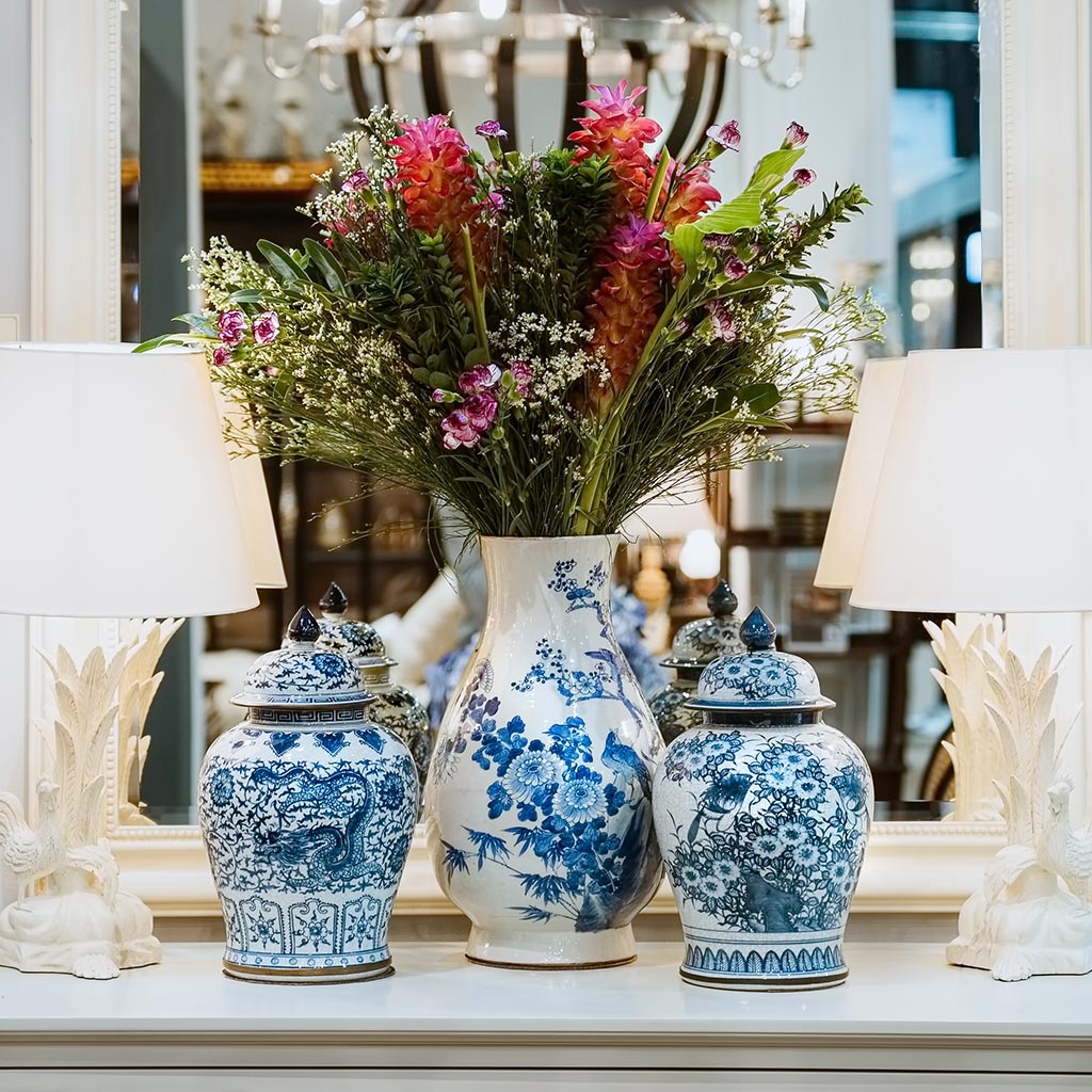


Pattern Mixing for Interiors
If you’ve been here for a minute, you know how much I love patterns. In fact, half of my business is creating them and working with manufacturers to bring them to life. Now that pattern mixing is back on the fashion runway, we’re seeing a more bold use of pattern in interiors. Publications are calling it “maximalism,” which it can be, but certainly does not have to be. Pattern mixing never goes out of style in interior design. It’s simply part of the process. What changes is how bold or subtle the mix is, and this all depends on the feeling you are trying to achieve.
There are three designers today who are masters of the print and pattern mix. The first is Kit Kemp, a co-founder of the Firmdale Hotel chain and world-renowned interior designer. Since she designs a lot of guest rooms, I often associate her work with gorgeous headboards and pillows, but it goes well beyond the guest room. The second is Brittany Bromley, an interior designer and author of Relaxed Elegance. Lastly, the inimitable Mark D. Sikes.

Kit Kemp Design Studio
When looking at their work, you can instantly see that pattern mixing is an art. It’s important to have some similar elements, and others that offer distinct contrast. There must be a push and pull to pattern mixing, a kind of energy that makes each pattern better by being side by side with the others. My first recommendation is to start with a print that you love. Then pull pieces that could coordinate, and when doing so, keep in mind color, scale, and overall feel.

Brittany Bromley Interior Design
Color: Similar colors usually work well together, but consider using a secondary color from your main print to pull the coordinates. If it’s a check or a geometric, it only needs a touch to tie back to the main print. If you’re going for a monochromatic look, keep it within a tonal range. A slight color difference from print to print will enhance the layered feel of a monochromatic design.

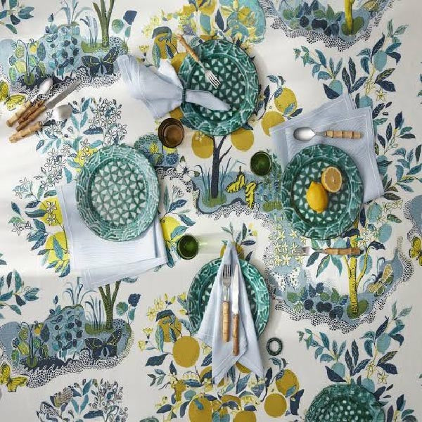
Mark D. Sikes for Southern Living Idea House
Scale: Scale is always a consideration. You must first think about the practical use case of your main print. If it has a large repeat, it’s best to see the print on a larger item, like a headboard or a sofa. It’s not a hard and fast rule, but small areas of larger repeat patterns don’t always give the full impact. Variation in scale is important as well. You need some prints to sit back and complement the others, to play a supporting role.
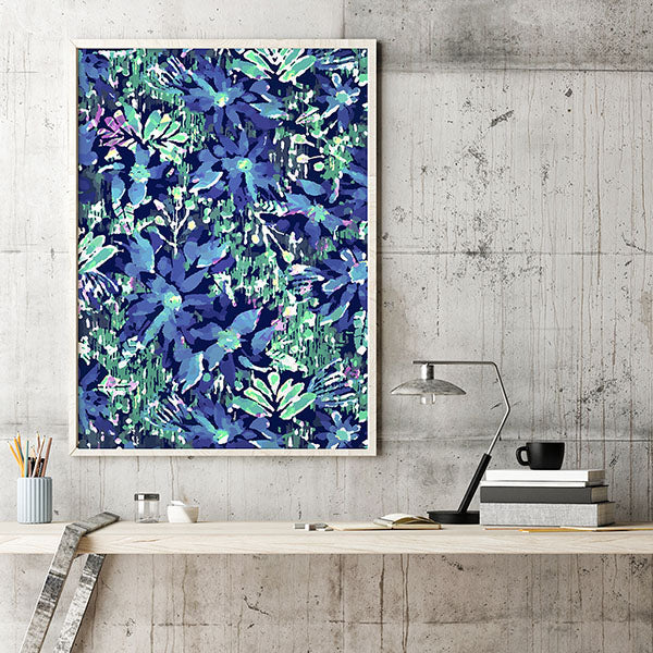
Motif style: Keeping the style consistent across printed textiles is another way to mix patterns more easily. Think about a hand-drawn floral next to a super precise geometric. I’d much rather see an imperfect geometric that enhances the hand-drawn floral print. If you have a more formal floral, perhaps you want a perfect plaid or ticking stripe.

Study what works. Go check out Kit Kemp, Brittany Bromley, and Mark Sikes. They each have a way of maintaining a modern sensibility while mixing patterns in their own style.

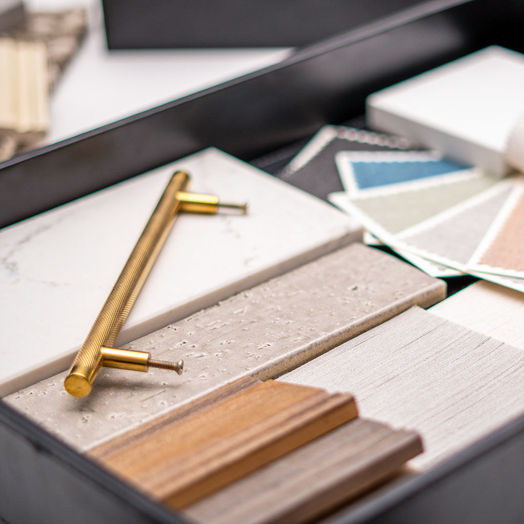
Finally, study your options. Create a spot where your patterns can sit together with the other elements of your design. A mood board, or even a corner of your dining room table will do. It’s essential to have them in a place you’ll see frequently, in different lights and with fresh eyes each time. It does not have to be formal (see above). Then make changes as needed until you find just the right mix of patterns to make your room sing. In the studio, we often live with selections like this for a week or two before making final decisions, so don’t rush it. Think outside the norm, and be bold!