


How to use Cinnamon Slate in your home
Our last post on Benjamin Moore’s 2025 Color of the Year, Cinnamon Slate, has been one of our most popular posts. In general, everyone seems to love this color, but when it comes to actually using it, people are stumped. It’s very sophisticated, but the idea that it could easily veer into purple territory terrifies most people from taking the plunge.
First things first, go get yourself a large sample of Cinnamon Slate at Samplize. Until you can see how it looks in person, in your room, at different times of the day, you just won’t be able to judge whether or not it is for you.

Let’s cover a few things you should know. This color can be paired with a warm or a cool palette. It has earthy, warm undertones which almost make it feel brown. If you have more warm colors like beiges and yellows, proceed with a little more caution. You’ll want to hold your samples up in all of the adjacent rooms to make sure the view or the transition from one to the next feels right. In general, you are looking at the undertone of each color and making sure that they work well together. If you can’t figure it out, schedule a call with me and we’ll talk color.

I truly think Cinnamon Slate is a color you need to go all-in on. It’s perfect for color drenching a small study or sitting room. It’s got just the right amount of mood, and when you color drench, you are adopting a tonalist approach. Your walls and trim will be the same color, but different sheens. This adds some depth but also enriches the overall vibe. This isn’t a move everyone would make, but they should!
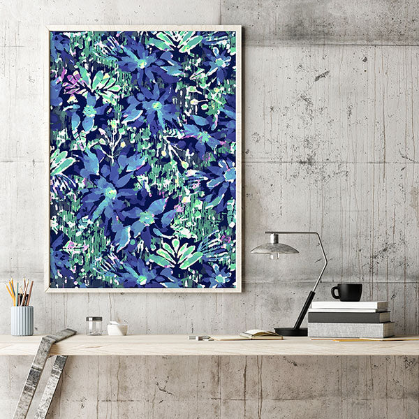
Yes, you can pair it with light, off-white trim if you prefer the contrast. I recommend leaning into the ethereal quality of this color. Pair it with silver accessories and lighting, and add softness and texture without adding a lot of other color. One exception would be a focal piece of artwork or a textile print. Alternatively, you can go for a deep dark contrast to Cinnamon Slate such as upholstery or a pattern in a deep aubergine.

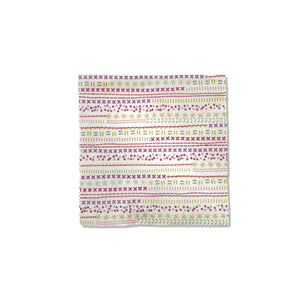
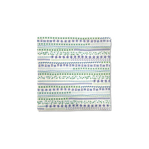
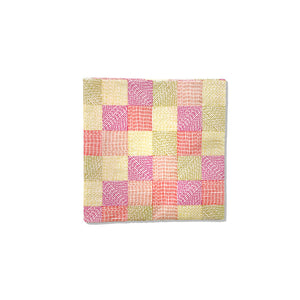
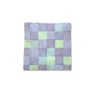
Think about how you can add texture, because with a limited color palette, this is how you create interest. If your room feels flat, it is likely missing texture. Some ideas are: embroidered pillows, a cozy throw, a wall filled with tone-on-tone decorative plates. I find that original artwork elevates almost every room. In fact, there isn’t a room in our home that doesn’t have original art of some kind.

If you want to integrate Cinnamon Slate into your home but you are struggling, try some of the ideas above. If you’re still stuck, book a call with me and I’ll help you work through it. Email me pics of your Cinnamon Slate rooms!