


Alternatives to the most popular color: Agreeable Gray
What do designers really think of Agreeable Gray? Today I'm digging deep into one of the most popular paint colors around and why you should consider a few alternatives before making the leap.
Agreeable Gray is easy to select because you can see it all over Pinterest, and more than likely, you can find a neighbor who has it somewhere in their home. You can also grab a generous and highly accurate removable paint sample from Samplize, because I highly recommend seeing ANY color in your home, under your lighting conditions.

Agreeable Gray
photo credit
I don't dislike any color, including Agreeable Gray, but I do think, in most cases, there are better options. The last time I specified Agreeable Gray was for a fraternity house, and we used it because it was appropriate for the space and the lighting-- read minimal, no lamps or rugs! We paired it with other colors to break it up, including off-white and deeper grays. There are places where this color just works well, and if you are looking for a basic backdrop, Agreeable Gray may be it. Notice how different it looks in each of these photos-- you do need to check a sample in your room.

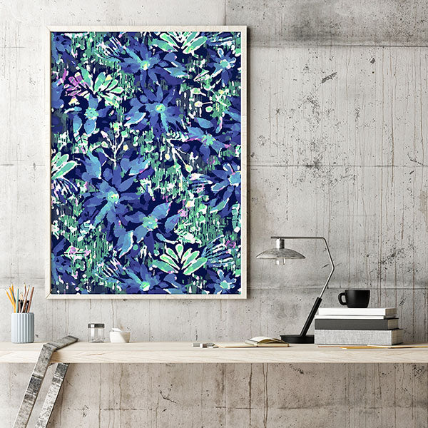
Agreeable Gray on Walls
But before you rush to Sherwin Williams, take a moment to consider a few other other options. An overall paint color is a commitment, and it can dictate what happens in the rest of your home.
My number one go to neutral is Benjamin Moore's Edgecomb Gray, HC-173 and I'd pick this over Agreeable Gray 8/10 times. This color is pure magic. It is a super elegant neutral that has a good amount of reflectivity and will even come alive in north facing rooms. Despite it's name, it is not gray. I think it falls in the gray category because of it's neutral base, but in my mind, it leans slightly warm without going yellow or beige. It has just a hint, and the color will shift depending on the light in your room. Pair it with White Dove (OC-17) trim or Onyx (2133-10) for drama.

Edgecomb Gray Photo Credit
My second option is Benjamin Moore's London Fog 1541. I have used this on walls and on cabinets and it is stunningly sophisticated. It's soft and super easy to live with. I've used it in traditional and contemporary settings with great success. London Fog is one of those colors. Once you know how lovely it is, you have to use it somewhere.


London Fog on laundry room cabinets and trim (under led worklighting)
If you're looking for a lighter, more subtle option, consider Benjamin Moore Silver Satin, OC-26. This can really be considered an off white with a neutral gray base. It gives you a touch of gray without the darkness. In a room with a lot of sunlight it will read warmer, and a northern facing room, cooler. I love the purity of this color, and everywhere I have used it feels instantly elegant. It looks great with silver and colors with a hint of blue.

Silver Satin OC-26 Photo Credit
My final option is Benjamin Moore Gray Owl (OC-52 or 2137-60). It is a crisp color that leans slightly cool, and it's super versatile. This one has been popular for many years, but it has such a classic feel to me, that I don't think it's going away anytime soon.

Owl Gray Photo Credit
If you are considering Agreeable Gray, but you have doubts, listen to your gut. Again, it's not a bad color, it's just expected. There are situations where it is absolutely the best choice. If you are spending the money to paint your home, make sure your color choices light you up, because you have to live them. Grab some large removable samples at Samplize and live with them for a bit No matter what your neighbors have done or what you've seen online, you have to consider what is best for your house and the vision you are trying to achieve.
Need help deciding? Book a Designer's Insight Call with Jenny today. Want a full plan you can follow to the letter? Book a complementary consultation call to talk about our Signature Room Design.