Add your deal, information or promotional text

March Color Inspiration: My Faves

I designed a board using pinks and grays because that's sort of what the emerging spring felt like in early March. It felt drab and underwhelming when I revisited it a few weeks later. As much as I love a challenge, my color comfort zone was the right place to be this month. This palette rules my life and, along with black, continues to find its way back, even when I try to stray. Hope you enjoy it as much as I do. 

If you'd like to get all of my inspiration delivered to your inbox, sign up to receive my monthly emails

 A collage of images featuring blue, green, gold, and off white. One image is a floral textile design by Jenny Bova, an ariel shot of Pleasant Bay on Cape Cod and the North Beach sea break, a blue hydrangea blooming, beach dunes, and seagrass. A series of solid color blocks is across the bottom, and the Jenny Bova logo is on the left. the format is a rectangle


As always, thanks for being here!
 

handwritten jenny sign-off

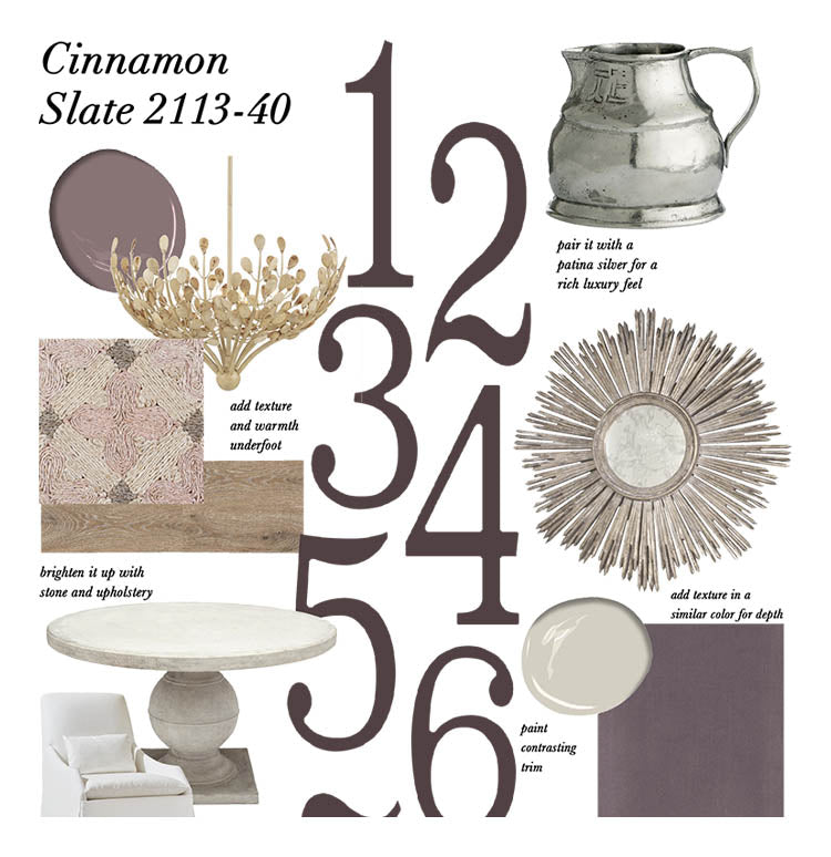
This is a deeper dive into Benjamin Moore's Cinnamon Slate. It's such a beautiful color, but many people don't know how to incorporate it. Here are Jenny's tips. 

Grant Achatz puts creativity at the forefront and it's super inspiring. Check out a few reasons why he's one of Jenny's creative heroes. 

Visual Comfort is my go-to for statement lighting. I'm sharing a few of my favorites here, but truly, it's hard to go wrong when it comes to Visual Comfort. 

Search